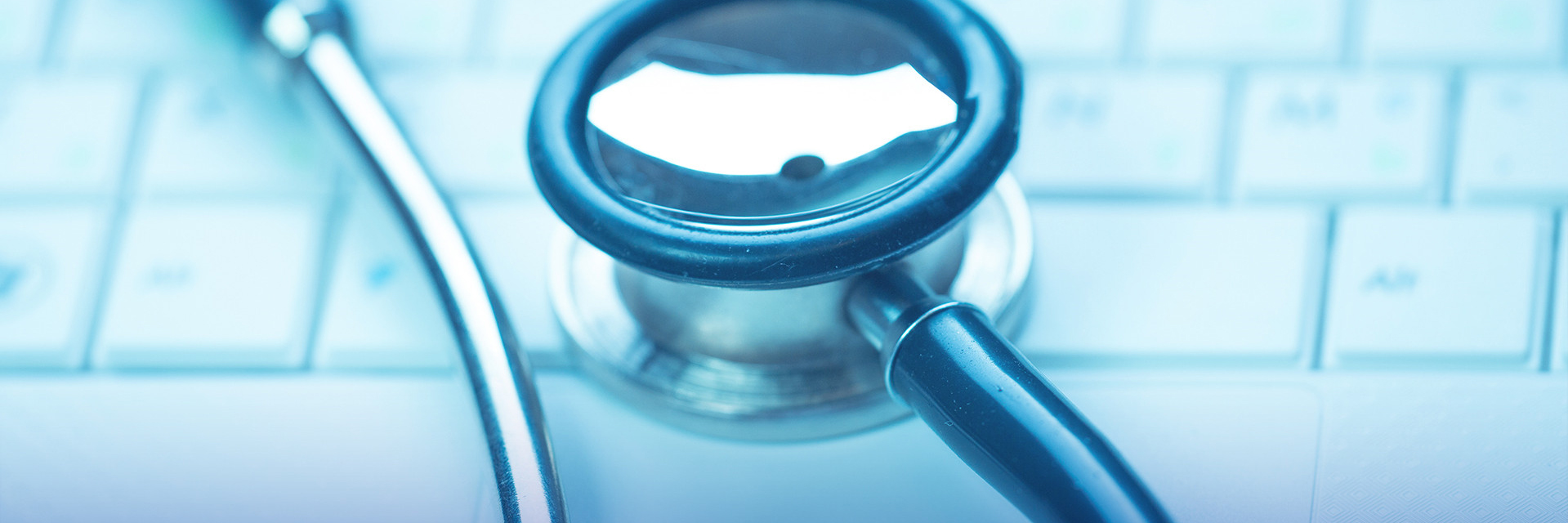
Zhende, a leading supplier of medical supplies and protective equipment in China, has upgraded the brand logo from the perspective of business and corporate philosophy and has put the new visual identity system into use, including a new tagline – “Professional, detail-oriented Service” – and a new logo.

Launch of the New Logo
A logo is a mark of a brand’s identity and is also the core symbol of brand culture. The new LOGO of Zhende not only reflects the attitude of the brand towards consumers, but also highlights the upgrade of its corporate culture and brand strategy.

On the basis of the old logo and the brand DNA, the new logo uses the sapphire blue and rose red color scheme to pay a tribute to the old logo and offer a new interpretation of the old logo.

The new logo maintains the key visual elements of the old logo. The initials of the company name – “ZD” – are modernized and simplified to make the logo more recognizable. The color palette for “ZD” is the popular sapphire blue and rose red, with the former symbolizing the unswerving brand mission and vision – a trustworthy partner in the field of medical supplies and the latter looking pleasant and representing the loving care of the brand for the general public and the enthusiasm for the consumers. Besides, the letter “Z” is designed to show dignity and the letter “Z” softness, which mirror the perfect melding of technical expertise with loving care in Zhende.

The logo has a simple and modern style that makes it unique and impressive. On the basis of the old logo, the novel design for the new logo creates a special visual effect. The solemn font is rounded and softened to mirror the loving care and thoughtful service the brand intends to convey. On the whole, the new logo helps improve the brand awareness and enhances the emotional ties between the brand and consumers.

The logo upgrade presents a new aesthetic symbol for the brand. The novel interpretation of the details of the new logo is consistent with the brand proposition – a professional medical supplies manufacturer and also a people-centric company. The new logo consolidates the brand character - professional, thoughtful and responsible, strikes a chord with consumers, spreads positive energy and echoes the active and positive image of the brand.

The brand face-lift represents an in-depth review and improvement of the brand’s visual identity over the past 27 years and also a vision for the future. Driven by the mission of “making healthy life more accessible,” Zhende has dug into the field of medical supplies, kept improving service and operating systems to cater to the needs of customers, and developed insights in the market, era, and brand that have gained recognition from the general public.

The new logo is the beginning of a new journey for Zhende. We will strive for further innovations, higher quality and more advanced technology while adhering to the company’s culture and value. The overall brand upgrade will allow Zhende to grow in a more dynamic and more international market.
We will stay true to our mission and embrace an even brighter future.

 Speech of president
 Zhende introduction
 Development history
 Honor of Zhende
 Corporate culture
 Brand story
 Industy news
 Zhende news
 Media Reports
 Anti epidemic zone
 Zhende overseas
 Sales center
 Talent concept
 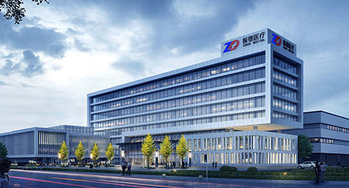 Work environment